The last two posts looked at the shades of blue used by both Waterlow and De La Rue on their printings of the low-mid values of the 1935 Silver Jubilee stamps. This post will examine the shades used by Bradbury Wilkinson. Like De La Rue, Bradbury's blue displays a wide range of different shades. The range is very vast, with a lot of overlap between their colours and the other two printers. In terms of overlap, there is a basic blue shade to be found, just like De La Rue, but there are also shades of grey-blue, violet blue and chalky blue, all of which can be found on some of De La Rue's printings. However, I would say that the dominant shade around which most of the variations revolve is either an indigo blue or a violet blue. However, Bradbury's blue will tend to appear darker than Waterlow's blue in most cases.
The full list of colours I have found on these is as follows:
- Chalky blue
- Very deep dull blue
- Deep greyish blue
- Deep bright blue
- Blue
- Deep bright violet blue
- Indigo blue
- Deep blue
- Deep violet blue
- Dark violet blue
- Violet blue
- Dull indigo blue
- Very deep bright blue
- Dark grey blue
- Very dark violet blue
- Bright chalky blue (used for Newfoundland only)
Again, like the other printers many of these shades appear very similar to one another, and I would say that overall, most Bradbury stamps appear to be a very dark blue, whereas most Waterlows appear to be a brighter blue by comparison, and De La Rue's appear to be duller blue that contains more green or grey.
The colonies that were printed by Bradbury Wilkinson are:
- Bechuanaland Protectorate
- British Honduras
- Falkland Islands
- Gambia
- Gibraltar
- Gilbert & Ellice Islands
- Gold Coast
- Hong Kong
- Malta
- Seychelles
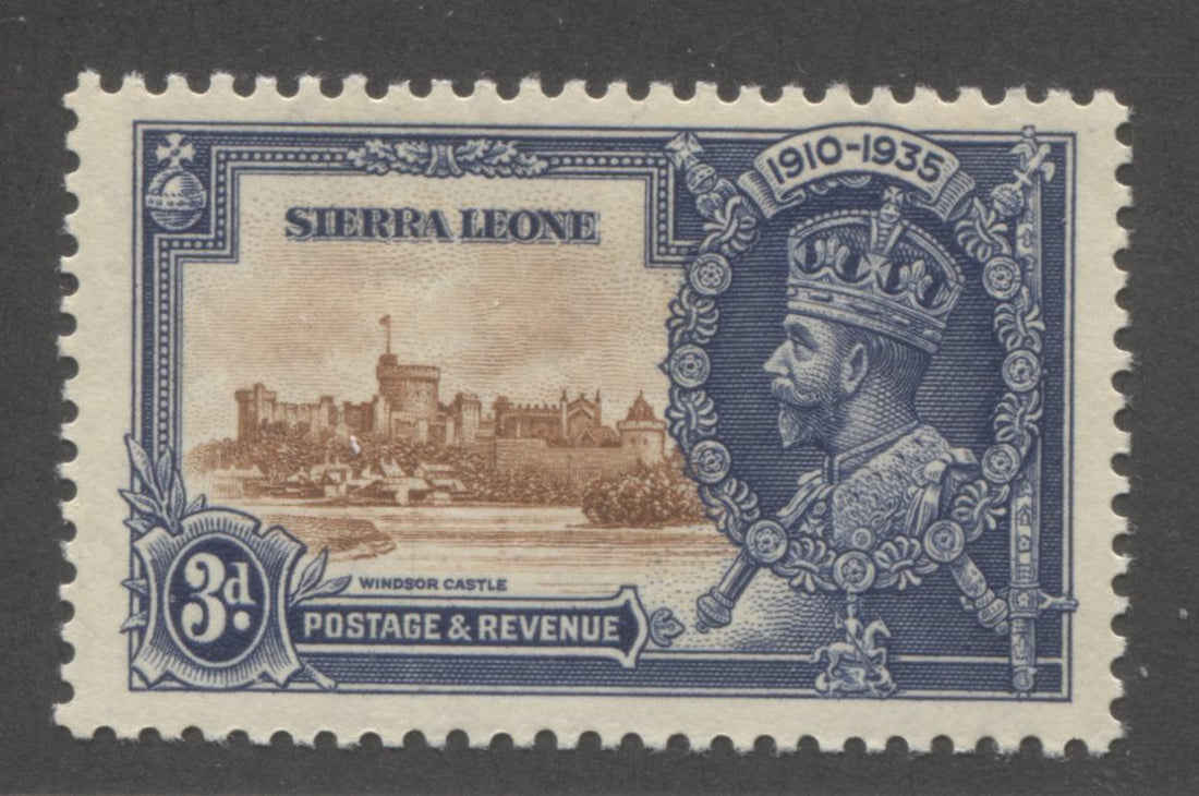
- Sierra Leone
- Swaziland
- Trinidad & Tobago
If we look at where these colonies are situated relative to the UK, we can get an idea of which would have, or should have been printed first. Gilbert & Ellice Islands is the furthest away by far, followed by Seychelles, Hong Kong and then Falklands. Those definitely should have been the first colonies printed. The last to be printed, on the other hand should be those colonies which are considered part of British Europe, so Gibraltar and Malta. That leaves us with Caribbean and African colonies. West Africa is as close to the UK as the Caribbean, so I would expect that British Honduras, Gambia, Gold Coast, Sierra Leone and Trinidad & Tobago would have been printed just slightly earlier than Swaziland.
Let's take a look at all of these shades now, comparing and contrasting them to one another, after we have looked at each one in turn:

Blue

Bright chalky blue

Chalky blue

Dark grey blue

Dark violet blue

Deep blue

Deep bright blue

Deep bright violet blue

Deep greyish blue

Dull indigo blue

Indigo blue

Very dark violet blue

Very deep bright blue

Very deep dull blue

Violet blue
Now that we have taken a look at them individually, let's take a look at them compared and contrasted together in three composites:

Looking at this first composite we can see that the inks used by Bradbury Wilkinson, exhibit some stark differences, as in the top row, but also some very subtle ones, as the two colours on the bottom row could be mistaken for one another, at first glance. However, careful comparison does show that they are indeed different. The dark grey blue and blue are miles apart. The bright chalky blue and chalky blue are the same tone, but clearly different levels of brightness. On the bottom row, the deep blue lacks the richness of the dark violet blue. Both of those shades are less intense and contain less black than both shades of the chalky blue.
Now let's take a look at the next composite:

Overall, these shades appear very similar to the last group. Again, you should be able to see stark differences mixed with very subtle ones. The subtle differences are between the first two shades, the deep bright blue and deep, bright violet blue and the deep greyish blue and the dull indigo blue at the bottom left. However, if you look closely you should be able to see the violet undertone on the deep bright violet blue, that is not present in the deep bright blue. The deep greyish blue lacks the dullness of the dull indigo blue, but is otherwise very similar. The indigo blue is neither as deep, or as bright as the first two shades.
Now let's look at the third composite:

Looking at this composite we see that all four colours are clearly different from one another.
Now, let's look at a comparison of the colours between all three printers:

The differences are so stark overall between these colours that one wonders how the catalogues like Gibbons could ignore them.