
Introduction
This set is one of those issues that on its face seems very straightforward, and has been very popular with collectors over the years because of the perforation and paper varieties that exist on the medium values, all of which were identified for collectors in the selvedge. Although this practice, of naming the paper manufacturer in the selvedge of the sheets had begun towards the end of the life of the previous issue, this was really the first issue where this practice was consistently followed for all values in the set, making the basic identification of paper types easy for collectors, or so it seemed.
Beyond this though, there didn't seem to be a whole lot more to the set. However, as I have returned to this issue several times and studied the stamps more carefully each time, I have discovered that there are actually a number of collectible variations of nearly all the stamps in the set, many of which are actually quite obvious if you know what to look for. The key to finding them is to become thoroughly familiar with all aspects of the different papers these stamps are printed on, which will reveal that there are additional hidden variations in several of the papers, and to carefully compare shades and details of the designs. Again, you will see differences that you never noticed before. The postal history of this issue is interesting as well, as several services that were offered such as special lettermail, priority post and the like were discontinued, when Xpresspost was introduced.
As Unitrade notes, this was the first definitive issue to feature first class stamps that did not appear in either booklet or coil form (the 37c Queen Elizabeth II). The sizes of the low value and first class stamps was made slightly larger, starting with the 38c values, than the previous small format stamps. The high value $1-$5 stamps were also the first not to have a white border around the design, but rather to extend across the perforations.
There were other historical firsts as well. The 50c vending machine booklets that contained one first class stamp and make-up low value stamps were discontinued, after the 40c flag stamp, and quick stick self-adhesive stamps were introduced, albeit at a premium over regular stamps. This was also the first issue to have booklet stamps that are perforated all around for every stamp in the pane.
All three printing companies, being Ashton Potter, BABN and CBN were involved in the production of this issue.
So, we'll start with some general observations about various attributes of the stamps and then we'll get into discussing specifics, as they relate to each of the stamps in the series.
Papers - The First and Most Important Characteristic
This was the second issue to be produced, where the name of the paper manufacturer is included right in the selvedge of the sheets. This ease of identification got the attention of collectors, who eagerly collected all the paper types, and then began to study them and note their specific characteristics. The study of the papers has uncovered some real rarities, where small amounts of one type of paper were either accidentally or intentionally used on very small batches of some values. The rarest regularly listed stamp in the series is the 74c wapiti on Rolland, rather than Harrison paper. So, the study of papers on this issue can be quite lucrative indeed.
However, the story does not end there. Despite being identified in the selvedge, pretty well all of these paper types exhibit variations in stiffness, fluorescence, direction of paper weave, the smoothness of the printing surface, presence or absence of ribbing on the surface, and whether or not any mesh is visible in the paper when it is viewed against a good, strong backlight. The differences I have found will be discussed under each paper type below, and I will mention on which stamps I have found them.
This issue utilized papers from no fewer than five manufacturers, more than any other definitive issue, which accounts, in large part for its popularity.
Harrison Paper
Harrison paper is a stout, but not stiff, whitish to off-white paper, that was used to print several of the first class stamps and was the default paper for the 57c killer whale and the second releases of the medium values and the $1 and $2. It has a somewhat matte gum that has a bluish green tinge, and also tends to curl either horizontally or vertically. It's use generally spans the period from 1987 until 1990 on this issue, with most printings after 1990 being on one of the other papers.
Harrison paper generally is DF on the front, though this is often obscured by the GT-4 tagging on many of the stamps. On the back it tends to appear greyish under UV. It also exists DF giving a lighter greyish-white glow, a DF bluish white glow, and occasionally it can be found to give a LF bluish white glow. For many years it was assumed that Harrison paper was always DF. However, Unitrade has begun to give recognition to the LF versions of this paper, listing LF booklet panes of the 37c and 38c parliament, and the $2 McAdam Railway Station. They have not, however, recognized the $1 Runnymede library on the same type of paper, even though it clearly does exist. On the $1 and $2 stamps this is best seen from the back, under UV.
The Harrison paper can be found in at least two different sub types. On one type the paper can be seen to contain clear vertical mesh, when held up to backlight, and on others, no such mesh pattern can be seen. The 37c and 38c Queen Elizabeth II stamps are two such examples of stamps that I have found both with, and without the vertical mesh. On the medium value mammal stamps, the Harrison paper usually has a visible horizontal mesh.
The Harrison paper is also found to exist in different weave patterns, which can be distinguished by the direction in which the paper usually curls, as follows:
- 37c Queen Elizabeth II - horizontal.
- 37c parliament - vertical wove for sheet stamps.
- 38c Queen Elizabeth II - horizontal.
- 39c and 40c Queen Elizabeth II - horizontal.
- 43c lynx and 74c wapiti - horizontal.
- 44c walrus, 59c musk ox and 76c grizzly bear - vertical.
- $1 and $2 - vertical.
- 6c, 37c, 38c, 1c, 2c parliament booklet stamps - horizontal.
Slater Paper
Slater paper is a cream paper that was used for most of the stamps in this series below $1. It is a very distinct paper, having a very shiny cream gum. The paper is soft compared to other papers, and it is thick. As a result the perfs have a somewhat "puffed up" appearance around the perf holes. This is particularly noticeable on blocks.
This paper was used to print all the first printings of the low values, the booklet printings of all the 38c and 39c first class stamps, the sheet stamps of the 38c parliament, the second and third printings of the 44c, 59c and 76c, the 45c, 61c and 78c stamps, the 50c vending machine flag booklets containing the 39c flag and all the quick stick stamps. It is used for a relatively short period of time between 1988 and 1990. By 1991 it is replaced by Peterborough paper.
The slater paper on most all the stamps of this issue is vertically ribbed, or rather, the chalk coating contains very fine vertical striations that can be seen if you tilt inscription blocks or singles in a strong light source. It is much easier to see on blocks though. On some stamps such as the 38c parliament, the ribbing is horizontal. The gum is shiny and thick, having a deep cream colour.
Under magnification, the surface of this paper is not smooth. Rather there is what appears to be a network of shallow indents that follow a crack pattern. Harrison paper has this to a lesser extent also, and this becomes apparent on used stamps. So, it cannot really be reliably used to sort used stamps into Harrison and Slater paper printings. For this, you generally have to look at the thickness and softness of the paper, as well as the appearance of the perforations and paper around these perforations. If the paper seems a little swollen around the perfs, then the stamp is probably on Slater paper.
The fluorescence is generally DF greyish or greyish white on the front, though bluish white can also be found. The fluorescence on the back is generally DF greyish, DF cream, DF greyish white, or DF bluish white, though on some of the first class stamps I have found LF bluish white. I have yet to find a LF variation of this paper, that is LF on the front, though I'm sure that one probably exists somewhere. We all thought that Harrison paper was always DF before the first fluorescent varieties of that paper were discovered.
Generally this paper does not show any mesh when held up to a strong light source, though I have seen printings of the 38c parliament stamp that show clear vertical ribbing when viewed through backlighting. Also, the booklet printings of the medium value mammal stamps seem to show vertical mesh when held up to backlight.
Peterborough Paper
This paper is notable for its hardness and stiff feel. It is whiter than the Harrison and Slater papers as well. The surface coating is smooth, with none of the ribbing found on the Slater papers. The gum is greyish and somewhat matte, having what can best be described as an eggshell sheen. Unitrade states that it is very shiny, but I don't think that is correct. It is not perfectly colourless, having a very, very slight greyish tinge.
This paper replaced Slater paper as the go-to paper of choice in 1990 and was in use from late 1989 until the end of the issue's life. It was used to print the 1989 printing of the 38c parliament sheet stamps, the 39c flag sheet stamps, the 40c Queen Elizabeth II sheet stamps, the 46c, 63c and 80c medium value mammals, the $5 BABN printing and all the coil stamps.
Under magnification the paper surface is perfectly smooth. There is one instance that I know of on the 37c parliament coil, where some examples can be found on a paper that shows horizontal ribbing on the gummed side. In theory the other coil stamps should exist, or could exist with this ribbing as well, though they are nit presently listed in Unitrade. They should be watched for though.
In terms of fluorescence, this paper varies quite widely, though on this issue it is generally DF on the front and back. Occasionally though, it can be found giving a LF bluish white reaction on the back, like what can sometimes be found on the Harrison paper, or a brighter MF reaction on the back.
Rolland Paper
Rolland paper is the whitest of the papers used in this series. It has smooth, white gum, is reasonably stiff and shows no mesh, even when viewed against backlight. It also exhibits the widest range of fluorescence of any of the papers, going from DF all the way to MF on this issue. Rolland paper was only used for a few of the earlier printings made between 1987 and 1988 of the following stamps:
- The booklet printings of the 37c parliament.
- The 57c Killer whale.
- The 74c wapiti.
- The 37c parliament coil.
The first two of these are relatively common, being normally issued releases. The last two are scarce to very rare, with only 200-300 known of the 74c wapiti.
Coated Papers Paper
This paper has a similar appearance to Slater paper, in that the surface is not smooth. Unlike Slater paper though, it is almost always NF or dead on the face under UV and DF greyish on the back. The gum generally has a light green tint and an eggshell sheen. The paper is much crisper and stiffer, though not as stiff as the Peterborough paper. Perforations punch cleanly on this paper, so the paper does not appear at all swollen near the perf holes the way that it tends to on the Slater paper.
This was the default paper for the reprints of the low values, made in October 1991, the booklet printing of the 40c Queen Elizabeth II and 80c Peary caribou, the sheet and booklet versions of the 40c flag stamp, the vending machine booklet flag stamps, being the reprints of the 39c booklet and the 40c booklet, and the 1992 reprints made by CBN of all the dollar values.
On the $1, $2 and $5, the paper is thinner than the other denominations, is shiny on the surface and shows very light vertical ribbing on the front.
Booklet Versus Sheet Stamps on the Same Papers
One problem that often arises for collectors on this issue concerns sheet stamps and booklet stamps that were printed on the same paper. Where the stamp has a straight edge, or two straight edges, this is not a problem, as the straight edged stamps must have come from a booklet. But what about stamps with perforations on all sides? Fortunately many can be distinguished by the direction of the paper weave, or the way the stamp curls, for those stamps on Harrison paper.
For the 37c parliament stamps, the sheet stamps are printed on vertical wove paper that curls from side to side, while the booklet stamps is on horizontal wove paper that curls from top to bottom.
The 38c parliament sheet stamps tend to be on paper that is vertical wove, whereas the booklet stamps are horizontal wove. The 40c flag sheet stamps are on horizontal wove paper, while the booklet stamps are on vertical wove paper.
Although they are a different perf, the medium value mammal booklet stamps on Slater paper can be easily distinguished by the fact that the paper of the booklet stamps bends in the horizontal direction, whereas the sheet stamps bend in the vertical direction.
Shade Varieties
There are quite a number of subtle shade variations on the stamps of this set:
- The low values can be found exhibiting differences in the colours of the mammal, as well as the background colours. Specifically, I have noticed variations in the upper background colours of the 1c, 2c and 5c. However, I am sure that with further study there will be variations in all of these. The variations seem to occur on both the Slater paper and Coated Papers paper printings.
- The 37c parliament stamp varies with respect to the blue of the sky and the green of the roofs. These variations can be found on both the booklet stamps and the sheet stamps, at least for the Harrison paper printings.
- The Queen Elizabeth II stamps can be found with different skin tones for the Queen.
- The 38c parliament multi-colour stamp varies mainly with respect to the blue of the sky, with some being a much brighter blue, while others have a duller, greyer blue sky.
- The 39c flag stamp exhibits different shades of blue for the sky, with the booklet stamps being a lighter, duller blue, or a violet blue, and the sheet stamps being a brighter, more vibrant blue.
- The 40c flag stamp can be found showing slight variations in both shades of the blue in the background.
- The 43c Lynx can be found with slight variations in both shades of background orange.
- The 74c wapiti can be found showing variations in the citron colour of the sky, with one being lighter and brighter than the other.
- The 76c grizzly bear can be found with at least two shades of the bright green colour of the horizon.
- The $1 Runnymede Library shows differences in the blue background, with some printings being a notably brighter blue than others. The green header above the door varies in intensity, the roof colour varies from brownish grey to jet back, and the door colour varies from pale red to deep red.
- The $2 McAdam Railway station shows differences in the shade of orange in the background, with some printings being a redder orange than the others, and other printings being a brighter, richer orange. The roof colour varies from grey to grey black and the green trim varies from light, milky green to a deeper, brighter green.
- The $5 Bonsecours Market shows differences in the colour of the roof and the columns flanking the dome. The roof colour varies from grey to black. The columns vary from a very pale, milky green to a deeper version of the same colour.
- The 40c Quickstick flag stamp shows distinct variations in the blue background colour.
These are just the differences that I have noticed in the stamps I examined this time around. I am sure there are probably more to be found on further study.
The scans below show some of these variations:

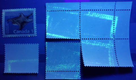
The 2c porcupine. Here, if you look carefully at the upper background colour you will see that the colour on the upper stamp is slightly paler and less yellowish than on the bottom stamp.

The 39c Queen Elizabeth II. Here you can see clear differences in the skin tones of the portrait.

The 39c flag stamp. Again, here you should be able to see that the blue of the sky is much deeper and more vibrant than the stamp at the top. The top stamp is a booklet stamp on Slater paper, while the bottom stamp is a sheet stamp on Peterborough paper.
Tagging
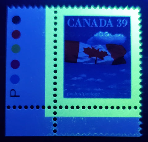
This is the first definitive issue in which the default tagging is GT-4. It is also the first issue to have a large number of entirely untagged stamps. The 1c-6c low value stamps are untagged, as are the high value stamps, and all the low value booklet stamps. The others are all GT-4.
The tagging itself varies in its appearance from having a semi-gloss sheen on the stamps, to having a very thick and glossy appearance on some of the stamps. This is particularly notable on some printings of the quick stick self adhesive stamps.
One interesting variation that does occur on the tagging concerns the appearance under UV. Most stamps have tagging which appears clear and sharp. However, on some stamps the tagging can be seen to diffuse and spread out, colouring the paper of the selvedge. I refer to this as the "diffuse tagging".
Because the low value stamps are untagged, one variety that can be found, which I find very interesting are ghost tag bars on the back of the low value stamps. These arise from stacking sheets with wet taggant on top of one another before the taggant has fully dried. In the earlier days of GT-2 in the 70's and 80's, ghost bars on the back on top of the gum are quite common. But by 1987 the quality control procedures at the printers were such that they are not found that often at all. So, when they do come up they are interesting. The scan below shows a few examples of ghost tag bars on the back of some of the low value stamps.
The scan below shows the 39c flag stamp with taggant residue on the face in the shape of perforation holes. This was found in a block and every stamp in the block had the residue in the exact same place, in just the clouds.
The stamps that are supposed to be tagged, can also exist untagged. The Adminware tagging database lists these, or at least every reported variety. Here is an example:
This stamp is normally supposed to be tagged on all four sides.
Occasionally examples of some booklets or stamps are found with errant taggant spatter or dots, such as on this booklet pane:
Perforations - The Second Most Important Attribute
The second most important attribute of this series are the differences in perforation. For reasons unknown, many releases of the stamps were issued with different perforations, and these new perforations went completely unannounced. Most all of them can only be found on field stock, which is entirely consistent with the idea that they were not produced intentionally. They are most likely the result of either temporary replacements of the perforating combs, while the ones in normal use were being repaired, or they are the result of the printer purchasing or leasing new perforating machines that had a different gauge from the ones normally in use.
The perforations found on this issue are:
- 13.1 x 13.6 - used by Ashton Potter on the low values, the booklet printings of the 38c parliament and 38c Queen Elizabeth II; by BABN on the 39c Queen Elizabeth II and all printings of the 40c Queen Elizabeth II.
- 13.6 x 13.1 - used by Ashton Potter on the 39c flag booklet printings, by CBN on the sheet stamps and all printings of the 40c flag.
- 13.1 x 12.7 - used by Ashton Potter on the reprints of the 1c and 10c, 39c flag and by BABN on the 38c Queen Elizabeth II, and the reprints of the 39c Queen Elizabeth II. These are all scarce, and although they are not listed, one wonders whether they exist for the other low values as well.
- 13.3 x 13.0 - used by BABN and CBN for the 37c Queen Elizabeth II and the sheet stamps of the 37c parliament.
- 13.3 x 14 - used by Ashton Potter for the booklet printings of the 37c parliament and all the vending machine flag booklets.
- 12.0 x 12.5 - Used by Ashton Potter for the 43c, 57c and 74c.
- 12.5 x 12.0 - Used by BABN for the engraved parliament booklets.
- 12.5 x 13.0 - Used by Ashton Potter for a small portion of the 39c flag vending machine booklets printed on Slater paper.
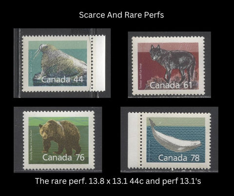
- 14.4 x 13.8 - Used by Ashton Potter for the 44c, 45c, 46c, 59c, 61c, 63c, 76c, 78c, and 80c mammal definitives.
- 13.8 x 13.1 - Used by Ashton Potter for a very small printing of the 44c walrus. Again, one wonders whether or not this perforation is really only found on this value, and not on any of the others.
- 13.1 - Used by Ashton Potter for some printings of the 45c, 46c, 59c, 61c, 63c, 76c, 78c and 80c medium value mammal stamps.
- 12.5 x 13.1 - used by Ashton Potter for the booklet printings of the 44c, 45c, 46c, 76c, 78c and 80c medium value mammal stamps.
- 13.3 - used by BABN and CBN for the $1, $2 and $5.
- 10 horizontal - used by CBN for all the coils.
That's quite a variety: 13 different perforations. What isn't clear is why there were so many, and immediately the question gets raised as to whether some stamps could exist in one of the above perforations where such a perforation is not known to exist on that value.
Here, we have some of the scarce perforations on some of the medium values.
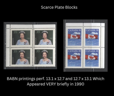
Here are the two scarce BABN reprints of the 39c first class definitives with the scarce perf.
Apart from the perforation measurements, there are also misperf varieties and imperforate varieties of stamps that should be perforated. Because the stamps are tagged on all 4 sides, any significant perforation shift will result in a tagging error. Most stamps in the set can likely be found with significant misperfs. Here are two examples:

A pair of the 38c Queen Elizabeth II stamp with the vertical perforations shifted 2.5 mm to the left, producing a G4aL tagging error.

Here is an example of the 38c parliament with the perforations shifted upward 4 mm, resulting in a G4dH tagging error.
The scan below shows some of the many imperforate varieties that can be found on this issue:

Interestingly, all of these varieties come from booklets. The two 39c Queen Elizabeth II varieties come from the same booklet. The 39c flag pair is also from a booklet, on Slater paper. However, Unitrade only lists the imperf pair of this value on Peterborough paper. Most of the stamps of this issue exist imperforate. It is useful to think instead about which stamps DO NOT exist imperforate, or at least are not listed in Unitrade:
- 3c muskrat.
- 25c beaver.
- 37c Queen Elizabeth II and 37c parliament.
- Booklet printings of the 38c parliament.
- 39c Queen Elizabeth II sheet stamp.
- 40c Queen Elizabeth II.
- 40c flag and mountains.
- 43c, 44c, 46c, 57c, 59c, 61c, 63c, 74c, 76c medium value mammals.
- The parliament and flag booklet stamps.
- The quick stick flag stamps.
Design Differences
If you look closely at the low value stamps and the high values, you can see small differences in the design details. The differences on the high values will be discussed there, but I will discuss some differences that can be found on the low values here.
On the low values, each stamp except the 3c and 25c has a background pattern that exists in addition to the main design. On some stamps this pattern stands out very clearly against the background, while on others, it is either muted or faint. Here are two examples on the 1c flying squirrel and the 2c porcupine:

If you look at these two stamps you will see that the spines or hairs that are in the air surrounding the flying squirrel are much more prominent on the bottom stamp as compared with the top stamp.
Here is a similar example on the 2c porcupine:

If you compare these two stamps you will see that the chevrons in the background of the second stamp are fully visible everywhere on the stamp. On the top stamp they are almost hidden by the dark green of the background. Both of these stamps are Slater paper printings, so the difference is not due to a change from Slater paper to Coated Papers paper.
After looking at these two varieties, I believe that the odourless skunk variety listed on the 10c is one of these types of varieties. In my opinion, the others should be listed also. I have not seen any similar varieties on the medium values, though I suspect they must exist.
Specific Notes About Individual Values
The Low Values
The low values were first issued on Slater paper, and then all but the middle three values being the 3c, 5c and 6c were re-issued on Coated Papers Paper in October 1991. On these reissues, the tagging was completely omitted. The 1c and 10c on Slater paper are known with the scarce perf, 13.1 x 12.7, but this perf. has not been reported on any of the other values, though it seems that they should exist on at least the 2c and the 25c.
I have found, on the 3c stamp a possible constant donut flaw affecting the sky on the 3c muskrat:

There may be other, similar flaws to be found on the other values. Also, I have found the 10c and 25c exist with diffuse tagging that bleeds into the paper, turning the selvedge of the affected stamps greenish.
The First Class Stamps and Booklets
The main point of interest for the first class booklet and sheet stamps are the paper and perforation changes, which I have already discussed in the general notes. There are the differences in shades that I mentioned also, as well as untagged and imperforate varieties.
The 38c parliament exists printed on the gummed side, and is also found with a double impression. The 40c flag and mountains stamp exists double printed also.
There aren't a lot of paper varieties listed on these stamps, but the 39c flag has two good ones, with the first being MF paper and the other being DF paper.
I have found a number of potentially constant donut printing flaws on these stamps:

39c Queen Elizabeth II with a large flaw under the "3" of "39"

38c parliament with a flaw above the N of Canada.

The 39c flag with a large flaw under the A of Canada.

The 38c Queen Elizabeth II with a flaw to the right of the last "A" in "Canada"
There are undoubtedly other flaws to be found. Despite the perception out there that these flaws are common, they are not. These are the first ones I have come across in my stock, and I have done several in-depth sales of this issue in the past few years.
On this issue the booklets produced were according to the number of stamps, rather than trying to set the face value at a fixed amount. The booklets were issued in two sizes: panes of 10 and panes of 25. Nowadays the larger panes are 30 stamps, but back in 1988 the large panes were 25. The only stamps available in the larger booklets were the parliament and flag stamps. The Queen Elizabeth II stamps were only ever issued in panes of 10. Because of the even number of stamps, and the fact that most panes were 3 stamps wide, this would mean that there would be two blank labels in most booklets.
The pictures below show the basic design of the first booklets for this series, containing the 37c parliament stamps:


The booklet of 25 with the two cover designs shown. The pane shown is the Harrison paper pane with a straight edge at the bottom. However, the panes on Rolland paper have a selvedge tab along the bottom.
Here are the panes of 10 that had similar cover designs to those shown above:

Again, you can see the different panes with selvedge at the bottom versus a straight edge. The panes of 1o were only issued on Harrison paper. There are several collectible varieties of these booklets. Unitrade lists all the basic cover types and the two different pane types where they exist, but they never get into listing the fluorescence of the booklet cover, nor the fluorescence of the panes themselves. It would seem that the cover stock exists on Harrison and Rolland stock, as these booklets can be found with covers that range from DF to HF. The Harrison panes are generally all DF, but the Rolland paper panes can be found with DF, LF, and MF backs. The larger booklets of 25 on Rolland paper can also be found with a horizontal tag bar that runs along the top of the tab.
Other things to watch for on these booklets would be typos on the cover or the inside cover text, or printing errors.
In 1988, the booklets were redesigned into folding booklets that sealed mid way up the cover, with the top portion being a tab that would display the number of stamps and the rate when the booklets were hung on a rack in the post office. Initially, the earlier printings of these booklets had the tab uncoated and rough surfaced, while the rest of the cover was glossy on the front, and the back cover was the usual white, chalk coated card stock. Later printings had the entire front cover including the tab printed in glossy stock. The general appearance of these booklets was thus:


As you can see, there were initially two different back cover designs: one for "stamps by mail" in which the owner could cut the tab off, fill it out with the requested number of stamps, provide a credit card number and mail it off to receive stamps in the mail. The other was a "Lunch Savers" design, urging people to pay their bills by mail.

In 1990 the back covers were re-designed to feature the annual souvenir collections. This was the go-to design for a number of years into the early 1990's. As you can see the new flying arrow logo gets incorporated into the booklet covers at this time.

In 1989 the back covers were redesigned for a second time, with the adverts for Priority Post courier replacing the other two designs. These were used until Xpresspost replaced priority courier in 1992. It is with this re-design that the new Canada Post logo gets added to the booklet covers.
Apart from the different cover designs, Unitrade does not list any other varieties of these booklets. However, I have found definite variations in the fluorescence of the booklet covers, and there are definite printing flaws that can be found on the covers themselves, such as this one:

Here you can see a large red blotch in the simulated margins of one of the 38c stamps.
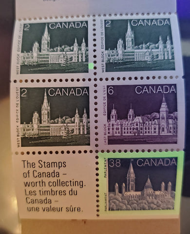
The Medium Value Mammals and Booklets
I've already been over the main paper and perforation differences of the medium value stamps, so I will not repeat them here, except to say that you should always check the perforations carefully on these, as I still expect that the scarce perf. 13.8 x 13.1 must surely exist on at least one other value.
Like the low values, I have found a donut flaw in the sky of the 78c beluga whale, as shown below:

Further study will be required to determine whether or not this variety is constant, and indeed whether or not it exists on other values.
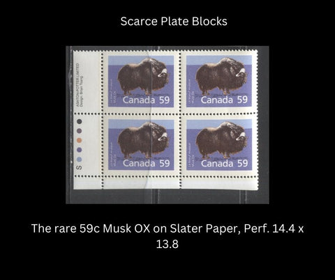
The absolute core of any advanced collection of this issue though has to consist of matched sets of all the corner blocks of these stamps, including all of the scarce perfs. Many of these are only found on field stock, though there are a few that exist with full inscriptions, such as the 59c musk ox on the Slater paper, perf. 14.4 x 13.8, shown below:
The booklets for these stamps follow the same design as the first class stamps, except that the booklets were issued in panes of 5. Because the panes were 2 x 3, a blank label is found in every booklet pane. Also, unlike other booklet panes from other issues, these ones had full selvedge around the sides, so that none of the stamps from these booklets will have a straight edge.

Unitrade doesn't list any varieties in these apart from a few cover changes. However, they can be found with different levels of fluorescence in the cover stocks.
The $1, $2 and $5 High Values
Of all the stamps in this issue, these are the most woefully described in Unitrade. Over the years I have found the descriptions of the reprints so confusing, with the result that I consistently mis-identified stamps trying to slot them into the four of five listings for them in Unitrade. The only one I could ever get right was the $5.
Part of the reason for this, as we shall see is that the August 1992 and July 1992 reprints listed in Unitrade are by no means the first reprints. There are actually several printings of the Harrison paper stamps made between their introduction in 1989 until 1992 that are not listed. Any study of a quantity of used stamps will quickly reveal this to be true.
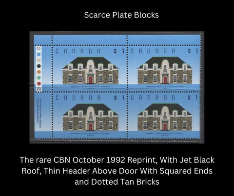
However, let's start by clarifying the differences between the two CBN reprints of the $1:


The above scan shows the August 1992 reprint on the left and the October 1992 reprint on the right. As you can see the August 1992 printing has a thick rounded green header above the door, just as Unitrade described. The tan bricks on the August 1992 reprint are always solid. The tan bricks on this example of the October 1992 reprint are dotted. The roof of the October 1992 reprint is jet black. Both reprints have dark blue lettering rather than black.
This is where it gets confusing, There is another printing that has a black roof, which has thick header shown on the left, with solid bricks and there is one that has the same characteristics as the one on the right, but with solid, rather than dotted bricks. Unitrade also further muddies the picture by saying that the roof of the August 1992 reprint is brownish. It is not. That colour is more of a grey black on the August 1992 reprint.
At this point, let's consider the BABN printings. They are all easy to identify because the lettering of the inscriptions is black. The roof is almost always brownish grey, though it can also be found in a grey black shade. The tan bricks can be solid or dotted, and the header above the door can be thin or thick, with squared or rounded ends.
Now, let's look at the printings of the $2. In Unitrade, reference is made to the dot pattern and the issue of whether or not it is uniform or random. However, they do not explain anywhere that this means, or what to look for to determine whether or not it is one or the other. I believe, finally after years of looking at this stamp that I have figured out what they mean.
Here is a scan of the July 1992 CBN reprint with what they call the random dot pattern:

If you look closely you will see that while dots are visible, they all merge into one another and they are not equally spaced apart. The dots themselves become solid colour just above the roofline of the building, whereas on the BABN printings you can still make out individual dots at the top of the "Canada" inscription.
Compare this to a scan of a used October 1992 reprint:

Here, you can see all the dots very clearly, and while the spacing between the dots decreases as you move toward the centre of the stamp, it is uniform at all horizontal points along the stamp. Therefore it is a "regular" pattern.
Now, let's look at the second characteristic that Unitrade mentions, being that of the roof spires and green trim:


The BABN printing is on the left and the July 1992 reprint is on the right. The trim on the BABN printings is a very light milky green, and the tips of the spires are very thin, as is the railing between them. The trim and spires on the reprint is a deep bright green. and both the tips of the spires and the railing between them are thicker.
Now, let's look at the October 1992 reprint:

Here we have a green that lies about mid way between the two colours above, but the spires are thin like the BABN printing. The railing between is thicker than the BABN printing, but not as thick as the earlier reprint.
Now, lets consider the $5, which is a relatively easy value to identify correctly:


The original BABN printing is shown on the left, and the CBN reprint is on the right. The main feature is the colour of the columns underneath the dome. On the original BABN printing they are a very pale grey green colour. On the reprint they are an almost olive green. The roof colour of the reprint is black, compared to the grey of the original, and all other accents on the building have been darkened.
I haven't studied enough $5 stamps to determine whether there are other intermediate printings that have characteristics that are different from these two, but so far all the $5 stamps I have handled fall into one of the above two printings.
The plate blocks of the two scarcer reprints are both very rare. The $1 is known with full inscriptions, though the $2 is only known as a field stock block. An example of the rare plate block of the October 1992 reprint of the $1 is shown below:
The Coil Stamps
In keeping with the previous issue that introduced the parliamentary design on the 34c and 36c coil stamps, this issue continued the design on the 37c and 38c values. Starting with the 39c, the design was changed to the new flag design. Like previous issues, these coil stamps were all printed by the Canadian Bank Note Company, using the same method of production that they used in prior issues.
Because the same production methods were used on these issues, the same general types of varieties, that result as a natural consequence of the printing method used should exist on these issues, even though they are not listed in Unitrade. These would include narrow and wide spacing varieties, as well as jumps. Unitrade does list narrow and wide spacing varieties, but only lists the jump strips on a few varieties, even though jump strips should exist for all the listed paper varieties.
All of the paper varieties can be found imperforate, Typically these start out as strips, which are gradually cut into pairs, resulting eventually in a strip that contains a full pair, one partially imperforate stamp and one fully perforated stamp. The scans below show examples of these imperforate varieties:


Quick Stick Stamps and Booklets
The quick stick self adhesive stamps were issued in 1989 and were reissued every year until 1993. These were the first self-adhesive stamps to be issued in Canada. They were initially not that popular, because Canada Post charged more than face value for the booklets.
An example of the 1989 booklet is shown below:


The first and only argument I ever head with a Canada Post employee happened when these stamps came out. I was 18 at the time and at the post office to buy all the new issues at the time (plate blocks, FDC's and the works). The person at the counter made the mistake of telling me that they had these booklets in stock but were not allowed to sell them to me for four more days. I didn't have a car at the time and had spent 2 hours on the bus to get to the post office to buy all these stamps and I really didn't want to have to come back in 4 days. So, I argued them into allowing me to purchase them ahead of the official issue date. Oops! I wasn't supposed to tell anyone. Oh well, its only been 33 years, so I guess I'm OK.
It would appear that these booklets were printed in sheets of three, which were then guillotined apart. As a result there are generally three different booklets that can be collected for each design that differ according to which side of the cover a certain feature of the booklet is on, and whether or not the tagging fully covers both sides, or whether there is no tagging on the left or right edge. The general types of these booklets are:
- Left booklet - cover feature on the right, no tagging on left edge.
- Centre booklet - cover feature on the left, tagging on both sides.
- Right booklet - cover feature on the right, no tagging on the right edge.
The feature on the cover, varies on each of the three booklets as follows:
- 38c booklet - the top of the mountain.
- 39c booklet - the barn in the distance.
- 40c booklet - the cliffs in the distance.
All of these booklets were printed on a combination of Slater and Fasson papers. The outer cover and backing are Fasson paper, and most are either LF or MF under UV. The stamps are printed on Slater paper, and all three are on paper that shows light horizontal ribbing. The 39c booklet can be found on smooth, non-ribbed paper. The 40c booklet can be found with tagging that has a normal semi-gloss sheen and another version that has a highly glossy tagging.
The scans below show the two back cover designs that are seen on these booklets:

The 1989 version with Priority Courier advertisement.

The 1991 40c booklet cover, with instructions and barcode. The barcode was not initially included on the cover, and so there are some booklets that exist with a label on the back with the barcode. These are quite scarce, and I have not seen, or had the opportunity to handle any as yet.
The 50c Vending Machine Booklets and Stamps
This issue was the last one to include the small format vending machine booklets that were sold for 50c each. They were discontinued at end of this issue because with the postage rates now being 38c-40c, these booklets would only contain one usable stamp, so that pretty well defeated the original purpose of having these, which was to enable consumers to conveniently buy a quantity of usable stamps that could be carried around in a wallet or pocket.
The engraved booklets were produced by BABN containing the 37c and 38c parliament stamps using the same cover designs as were used for the booklets of the previous issue, being different views or architectural features of the parliament buildings. Later, when the 39c stamps were to be issued, it was decided to change the stamp design to the Canadian flag, and the method of production was changed to lithography, and Ashton Potter was chosen for this task.
One potential point of confusion or potential error in Unitrade concerns the covers of the booklets. Unitrade lists Abitibi and Rolland covers. However all the covers have an H on the back for "Harrison". My belief is that the covers are all Harrison covers, just as they are labelled, and that some of them are low fluorescent and some are dull. They can't be Abitibi, because that company went bankrupt in 1983, and while they could be Rolland, it seems more likely that they are what they are labelled as, which is Harrison".
The panes are all printed on coated Harrison paper which varies from a DF greyish colour under UV to a LF bluish white. Unitrade finally decided to recognize the LF paper this year, with the result that the singles and panes are all listed on both papers, though I notice that this has not been carried through to the complete booklets.
The panes themselves contain either light blue, green or deep green markings on the tab, which include a horizontal bar running across the tab. The bar is deep green on the 38c booklets and either deep bright green or light blue on the 37c booklets. The scans below show examples of each:


One difference I have noticed that is very interesting, but entirely unlisted by Unitrade or even the old McCann booklet catalogue, concerns the vertical placement of the bar on the booklet tab. I have found that for tabs of approximately the same width, the placement of the bar varies from 10.5 mm to 14 mm above the perfs of the top row. The scan below shows some of these differences:

In addition to the tab markings being placed at different heights, there are several other constant varieties that can be found either individually, or in combination with other varieties on both the 37c and 38c booklets:
- A single perf hole in the centre of the tab at the top.
- A horizontal tag bar at the right side of the tab at top.
- A sliver tag bar on the left side of 3/1.
In addition to these varieties, there are also varieties on the stamps themselves that arise from the wear that the engraved plates experienced. Most of these are in the form of small white printing voids, short prints and vertical hairline scratches in the margins. The scans below illustrate examples of some of these:

Vertical scratch in the margin at right.

Damaged background shading at right.

Short print at lower right.
The flag booklets are relatively straightforward, but there are marked differences that exist in the fluorescence of the covers, with DF, LF, MF and HF covers existing, and the slater paper exists in a DF greyish and DF greyish white. The 40c booklet can also be found with a printed rate change notice on a slip of paper glued gently into the booklet cover. The single example of this that I have seen was from 1993, as it contained the new 43c rates.
Adoption of the New Canada Post Logo and Canada Post Products
In late 1988 Canada Post changed its logo from the old framed maple leaf to the speeding arrow, and a new, separate logo was designed for the philatelic service. This meant that the insert cards for the sealed plate block and stamp packs would undergo yet another change in design. The precise timing of this change can be seen in comparing the new issue bulletins for October 1988 and December 1988:

The October bulletin is shown on the left, while the December one is on the right. As you can see, the October bulletin shows the older logo, while the December one shows the lettering of the new logo.
The plate block packs exist in at least three different formats for this issue, with the newer design being found on any issues after December 1988. The scan below shows two of the medium value packs on Slater paper and two backs of two lower value packs:

The two formats for the insert cards are type 6, with the new Philatelic Service logo and the type 4A or 4B with "Canada Post" on either one line of text or two lines of text. The implication of the change to the new logo being made in December 1988 is that the following issues should exist with both types of inserts:
- The 1c - 25c low values.
- The 37c parliament.
- 37c Queen Elizabeth II.
- The 43c Lynx, 57c killer whale and 74c wapiti.
Covers and Postal History
The postal history of this issue is an interesting area due to the fact that the issue was gradually introduced while the previous issue was current and it blends into the next issue. So, mixed frankings are to be found on both sides. There were a number of rate changes during the life of this issue, and other services like Special Lettermail and Priority Courier were abolished during the life of this issue, so covers for these services will be found.
The scan below shows an example of some of the registered covers that can be collected from this issue:

Domestic registered covers showing various mixed frankings from this issue and the following edible berries issue.
Some of the medium values are quite scarce to find as single usages. A good example is the US rate stamps used on domestic overweight covers. You'd think they would be easy, but most collectors weren't saving covers that were this recent, with the result that many are surprisingly scarce. The scan below shows a postcard to Belgium franked with a single 76c grizzly bear:

Conclusion
Despite appearing to be a very simple set, it is my hope that this post has shown you that there is far, far more to this issue than meets the eye, and therefore that there is a real opportunity to build an award winning collection resulting from a detailed study of these stamps. I hope this post has been helpful and has inspired you to delve a little deeper into these issues.
4 comments
Bonjour Claude
Merci pour vos commentaires sur mon blog. En fait, j’avais l’habitude de faire traduire le site Web en 16 langues. Mais j’ai reçu beaucoup de plaintes selon lesquelles les traductions n’avaient aucun sens. Maintenant, c’était il y a 3 ans. Les choses se sont améliorées avec la traduction linguistique, et j’envisage donc de réintroduire au moins le français au cours de la nouvelle année. Comme vous pouvez l’imaginer, il y a beaucoup de contenu à traduire et je dois étudier les effets sur la vitesse de mon site Web.
Ma meilleure suggestion pour le moment est de cliquer avec le bouton droit de la souris et de tout copier dans Word, puis de le traduire en français à l’aide de Google Translate.
Faites-moi savoir si cela ne fonctionne pas.
Cordialement,
Chris
Comment avoir tout ça en francais,je possède beaucoup de ceux la
Yes, please do print it. I will eventually produce my own book, yes. I don’t know when that will be though.
Can this be purchased as a book? If not, can I print this out?
TOM CRAIG