
This week, I begin my series of detailed posts about the stamps of this fascinating definitive issue, with a discussion of the type differences found on the medium value landscape stamps from the series. Last week in my overview, I already discussed the differences on the 10c, but I will repeat them again here just so that everything is included in one easy to find post. I will also discuss the constant varieties that are listed in Unitrade, most of which result from colour shifts, but some of which are constant plate flaws.
Type Differences On The Landscape Designs
Except for the 20c prairies, all of the stamps from the 10c to 50c were printed using 2 plates, while the 10c was printed using 3 plates. In some cases, such as with the 25c, the two plates found are plate 1 and plate 2, with no plate 2 having been used. Usually, in the case of the 10c, 15c and 25c, the change from plate 1 to plate 2 brought with it, small, but distinct differences in the inking of the designs which have come to be known as the "types". In the case of the 50c, the two known type differences are both found on plate 1, which might explain why Gibbons does not recognize it as a legitimate type difference in the way that they do with other values.
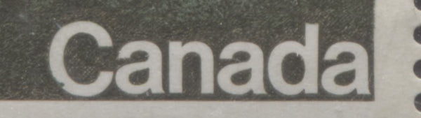
The 10c Forests Stamp
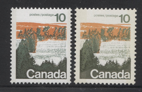
On the 10c forests design, there are actually three layers of colour:
- An orange layer of sunset in the background.
- A grey green layer of trees in the background, and
- A dark green layer of foliage which has been engraved over top of the grey-green.
On type 1, the green background behind and around the word Canada is clearly cross-hatched. On type 2, this same shading appears much darker, and appears to be solidly inked, though it actually is not - it is still cross hatched, but spaced so close together as to appear solid.
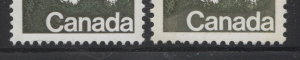
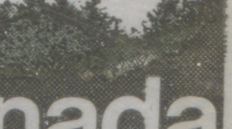
In addition to the type differences that are listed in Unitrade, there is also evidence that different photogravure screens were used to print the stamps. This can be seen most clearly, by looking at the lettering and the numerals, and the two trees at centre left. On some stamps, the lettering and trees appear almost solidly inked. On others you can see evidence of the printing being made up of tiny dots, but the dots merge and form almost a solid mass of colour. Still, on other stamps from some of the scarcer printings I might add, you can see very clear screening dots that are distinct and separate from one another. Generally speaking the solid inking only appears on type 2 stamps, while the semi-solid inking appears only on type 1 stamps, and the dotted inking can be found on both types.
Below I show you two close up-scans of these differences, first on the stamps of type 1 and then on the stamps of type 2:
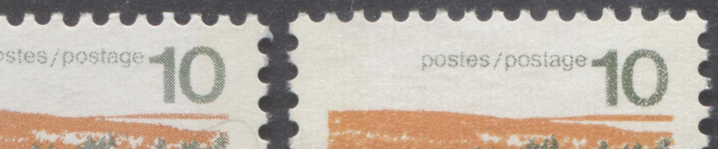
If you look at the stamp on the left you can see that all the photogravure portions of the green ink appear as clear dots. On the right you can tell that the printing is made up from fine dots, but at the same time it also has a somewhat solid appearance. These stamps are both type 1.
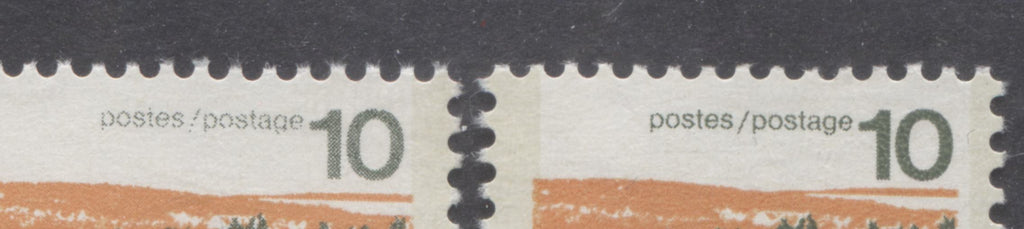
On the left you can see that the green printing is comprised of dots and the letters in "postes/postage" appear incomplete and broken. However, the orange appears much more solid. On the right, the inking all appears solid, with the letters "postes/postage" appearing complete and unbroken.
These differences are not listed in Unitrade, nor are they specifically mentioned in the handbooks that I have seen that deal with this issue. However, I think you would agree that they are at least as significant as the type differences, and should be studied.
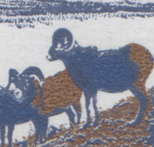
The 15c Mountain Sheep Stamp
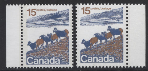
On this stamp, there are three layers of colour:
- The brown photogravure, which comprises the grass and bodies of two sheep and rump of one, and is printed first, and,
- The deep dull blue portion of the design, which is all engraved and printed on top of the brown.
- A brighter blue, which is printed by photogravure, on top of the deep dull blue.
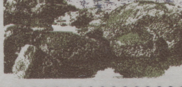
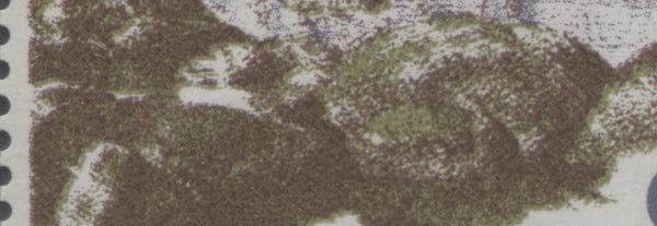
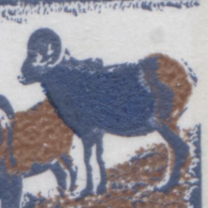
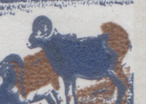
On Type 1, the shading in the mountain, off to the horizon looks more or less even. On Type 2, there is a solid patch of colour in the centre of the mountain. Below is a close up to show the difference clearly:
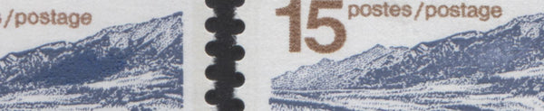
On the left is type 2 and on the right, type 1. Most all of the type 1 stamps I have seen that come from plate 1 show semi-solid inking on the brown photogravure portion of the design. All of the type 2 stamps I have looked at show solid inking on the brown portions of the design.
The 20c Prairies Stamp
As stated in the beginning of this post, this stamp was only printed from plates 1 and 3, and there are no known type differences. There are just two layers of colour:
- The orange colour, comprising most of the fields, which is printed first, by photogravure, and
- The deep lilac colour, which comprises the contrast of the planted fields and the lettering. This is printed by engraving over top of the orange.
The orange colour always appears as a semi-solid inking, with screening dots being visible on all the printings that I examined, including those from plate 3.
The 25c Polar Bears Stamp
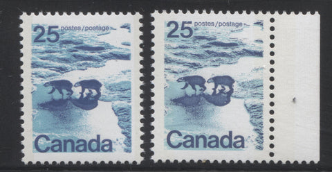
Unlike the 10c and 15c, where the lettering and engraving was printed by photogravure, the lettering on the 25c is engraved. The design consists of two layers of colour on the type 1 stamps and 3 layers on the type 2's:
- The azure coloured ice, which is printed first, by photogravure, and
- The dark blue bears, waves and lettering, which is printed on top of the azure.
- A brighter blue, which is printed by photogravure on top of the bears and the shadows, on the type 2 stamps only.
On the type 1 stamps, the shading both inside the bodies of the bears and in the shadows of the bears is more or less even in the middle, and a little darker around the edges. On the type 2 stamps, there is a heavy solid area inside each shadow and inside each body of each bear. A close up scan of these differences is shown below:
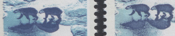
Type 1 is shown on the right, while type 2 is shown on the left.
All of the stamps that I looked at, whether or not they came from plate 1 or plate 3 (there was no plate 2 for this value) show azure that is almost solidly inked, with just a few screening dots visible at the edges.
The 50c Seashore Stamp
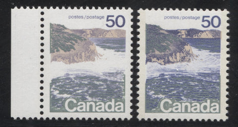
On this stamp there are three layers of colour:
- The beige colour which represents the rock faces of the cliffs. This is printed first, using photogravure.
- The blue colour of the ocean and the shadows on the rock faces. This is also printed using photogravure and is printed second.
- The grey-green colour, which provides detail on the waves, the shading behind the lettering and the vegetation on top of the cliff. This is printed using engraving and is printed last.
On the type 1 stamps the blue is printed using very coarse screens, so that it appears light, and with screening dots that can clearly be seen under magnification. The lettering on type 1 stamps usually appears almost solid, but on the edges you can tell that they are printed from many, many dots placed close together. On type 2 stamps, most of the blue, especially the denser part of the water and the shading on the cliffs appears nearly solidly inked, and the lettering appears solidly inked. On the type 1 stamps, the beige colour appears almost solidly inked, whereas on the type 2 stamps it definitely appears solidly inked on all the stamps I examined.
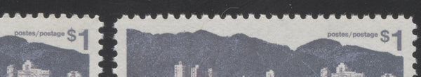
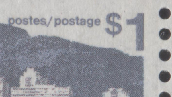
The $1 Vancouver Stamp Printed by Photogravure and Engraving
This later printing of the $1, first issued in the fall of 1973, consists of four layers of colour:
- Lilac, which provides depth to the rocks on the beach, the shading on the water and on some of the buildings in the skyline. This is printed by photogravure, and is printed first.
- Green, which appears in the horizon for the greenery near the buildings and the rocks in the foreground is also printed by photogravure and is printed second.
- Agate, or black brown, which is the dominant colour of the rocks is printed by photogravure and is printed third.
- Finally, the grey-lilac blue, which forms the mountains, the lettering, some shading on the water and the buildings is engraved, and is printed last.
There are no type differences per-se, on this stamp, except that I have noticed instances in which the agate colour appears solidly inked, which it does on most stamps, others where the screening dots are clearly visible and still others from the later perf. 13.3 printing where the rocks appear out of focus and blurry.
These differences are shown in the close-up scans below:
This picture shows the agate shading that appears more or less solid on the rocks. This is how most of the perf. 12.5 x 12 stamps appear and how some of the first perf. 13.3 stamps appear.
At first this picture looks similar to above, but if you look closely, you can see the individual brown dots that comprise the shading. This is only found on the perf. 12.5 x 12 printings.
These are the blurry rocks that only appear on the last printings perforated 13.3.
Varieties
A few constant varieties are listed in Unitrade, some of which are due to plate flaws, and others which are due to colour shifts.
The Scratch In The Mountain on the 15c Mountain Sheep
This variety occurs on position 10 of plate 1 only. Unfortunately, I have not come across an example I can scan, but it consists of a horizontal scratch through the top of the mountain at the upper right of the design.
The Brown Soil in "Canada" on the 15c Mountain Sheep
This occurs on position 94 of all sheets and is very similar to the vegetation invasion variety discussed below. A small smudge of brown appears inside the last "a" of "Canada". Again, I do not have an example I can illustrate at the moment.
The Blue Tail and Raised Rump Varieties on the 15c Mountain Sheep
This variety occurs due to a colour shift, and it involves the back of the sheep closest to the right side of the design. Normally the rump of the sheep is a smooth curve and the brown ink does not encroach on the blue ink and vice versa. A normal sheep looks like this:
Note how smooth the curve on the back end of the sheep appears.
Here is the blue tail variety:
This variety is caused by a rightward shift of the blue, causing the tail to detach from the rest of the rump and become visible.
Here is the raised rump variety:
Here, the rump appears disjointed. This is caused by a downward shift of the blue. Some might say that the brown is shifted up, but this isn't quite correct because the brown is clearly printed first, before the blue.
The Double Headed Sheep on the 15c Mountain Sheep
This variety is only listed by Unitrade as occurring on Type 2 and involves the first sheep from the left having what appears to be a double head. Unfortunately, the type 2 perf. 12.5 x 12 stamps are quite scarce, and I don't actually have any in my stock. So I am unable to show an example of it here, but it looks more or less like you would expect. According to Unitrade it results from a colour shift, but it is hard to see how this could be, given that the sheep is printed from a single colour.
The Siamese Bears on the 25c Polar Bears Stamp
Unitrade states that this variety is due to a colour shift. I had thought that this could not be the case, because the variety involves the joining of the bears that were both printed by engraving at the same time. A close up scan shows the variety below:
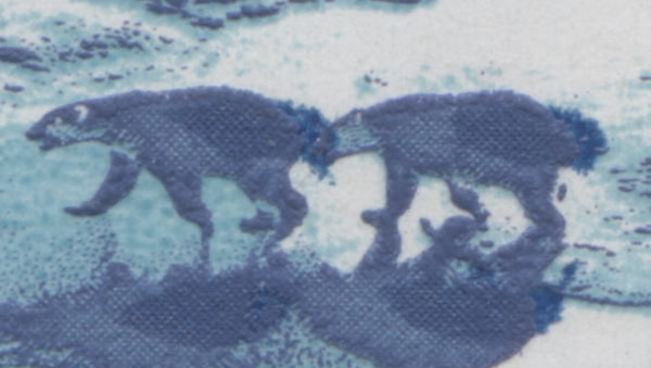
As the scan shows clearly, the variety is due to a different shade of blue ink. However, Robin Harris, the editor of Unitrade pointed out that a third cylinder of blue ink was printed over top of the bears, and that it is this colour that has shifted, resulting in the variety.
The 50c Seashore Stamp
According to Unitrade, there are six minor constant plate varieties that occur on these stamps, four of which occur on type 1 stamps and two of which occur on type 2. Having never seen these varieties I had to do some research to find out what three of them are. But I was unable to find information on the other three. I would be very appreciative if any of my readers can shed some light onto what the missing varieties are and if they can provide examples:
- A small blue dot appears inside the loop of the "5" of "50".
- A horizontal scratch appears in the sky just above the central cliff and extends from the "O" of "Postes" to the bottom of the "5" of "50".
- A blue dot between the scratch and the "t" of "Postes".
These varieties occur on positions 9 and 10 of the affected sheets. They are very light and difficult to see, which is why they aren't listed in Unitrade, I think. The scans below show examples of all three varieties, with varieties 2 and 3 occurring on the same stamp:
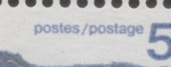
This scan shows the dot beneath the "t" of "Postes". The horizontal scratch is there too, but it is very light and you can only just make it out near the bottom, of the "5".
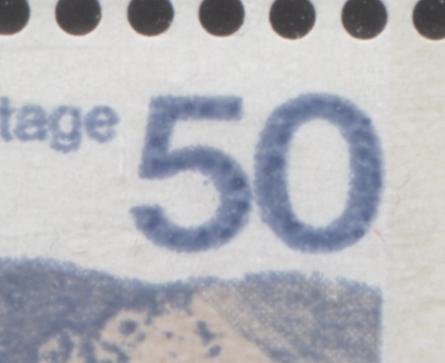
Here you can just see the small dot inside the "5" near the top of the inside curve.
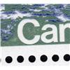
The Type 2 perf. 12.5x 12 stamp also exists with what Unitrade calls the "Broken C". This variety involves a upward shift of the grey green into the blue water, causing the truncation of the "C" of "Canada" at the top. The scan below shows an example of this variety:
It is not a great image unfortunately, but it is the only one I could find.
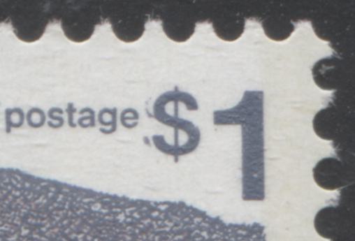
The Short $1 Flaw and Dot After Postes on the $1 Vancouver
These varieties occur on positions 21, 22, 23 and 24 of all sheets of the lithographed printing of the $1. The Dot after Postes occurs on position 22, always in combination with the short $1 flaw. Basically with the normal stamp, the vertical line through the dollar sign extends all the way through on both sides. On the variety, the line does not extend beyond the top of the dollar sign. The high resolution scans below show the normal dollar sign and both varieties:
The normal dollar sign is shown on the left, while the short dollar sign is shown on the right.
This picture shows the dot after the "S" of "Postes" and the short dollar flaw.
The most popular way to collect these varieties is as a se-tenant strip of 5, which has four stamps with the varieties and the last stamp normal.
The Airplane in the Sky on the $2 Quebec
This variety, which occurs on plate 2 printings only, can be very easily missed if you are not looking for it, or do not not know what to look for. It is one of those varieties that looks clearer from afar than it does under magnification. It occurs on position 2 only, so it is always found in upper left plate blocks. Unitrade's illustration shows it as a black dash in the sky, but when you view it up close under magnification, it just looks like a light black smudge. The correct place to look for it is just above, and to the right of the third chimney from the left.
Other Varieties
I have come across some varieties which are not listed in Unitrade, but which occur with enough regularity that I feel that they deserve some mention here. They may or may not be constant, or at least semi-constant.
The "Vegetation Invasion" on the 10c
This variety I have only come across on the type 2 stamps. It consists of seepage of green ink into the white of the letters of "Canada" that make the letters appear as though vegetation is gradually encroaching it. Normally, the lettering for "Canada" is very sharp and clean, but on this variety it appears less sharp, as in the pictures below:
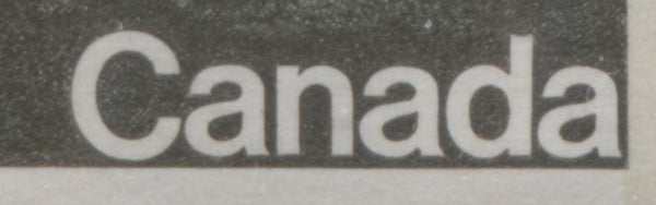
Here is the normal, clean lettering found on the type 2 stamps.
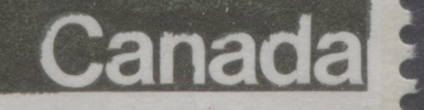
Here is the variety. Note how the blobs of green make it appear as though the letters are being overgrown by vegetation. I do not believe it to be a truly constant variety, as I have noted that it occurs in varying degrees of severity, with the above being one of the stronger examples. The scan shows two less severe examples, one from plate 2, and the other from plate 3, which is very minor indeed.
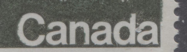
Here is the slightly less severe example of the variety that shows the ink being mainly confined to the "c", the "n" and the "d".
This is a very weak version of the variety, that just shows a small nick inside the lower half of the "C" of "Canada".
The "Bare Patch" on the 10c
I do not know if this is constant or not, but I have one example of type 1, in which there is a clear white patch in the green cross-hatched foliage where there would normally be solid colour. I believe that this may be due to a slight downward shift of the engraved colour. A close up scan showing the variety is shown below:
The Doubled Dollar Sign on the $1 Vancouver
I bought, quite some time ago, a pair of the $1 Vancouver, from the perf. 13.3 printing, in which one stamp shows distinct and partial doubling of the dollar sign on the left side. A close up scan is shown below:
I have no idea whether or not this is constant, as it is the first, and only example I have seen. I would greatly appreciate any input that readers can offer about it.
This concludes my examination of the type differences on the mid-values of the series and the constant and non-constant varieties on the mid-values and high values. Next week I will look at the low values and some of the varieties that can be found on those stamps.
1 comment
Interesting read … I may be able to aid in some examples of some of these varieties and/or confirm, as well as other info…
Steve